The University of Texas at Arlington Philanthropy
The University of Texas at Arlington Philanthropy
The UTA Philanthropy Conference Website is a digital platform designed to centralize event logistics and streamline the attendance experience for faculty, sponsors, and specialized external guests by providing clear registration paths, essential campus navigation, and confidential submission of dietary and expense requirements.
"Uniting Vision. Empowering Action. Immediate Clarity."
Creating a clear, convenient portal for all attendees to access logistical information and seamlessly manage their conference experience.

-
Teamwork Goal
The unifying goal for the entire team was to elevate the UTA Philanthropy Conference brand and attendance by increasing awareness, securing sponsorship, and managing capacity constraints.
This was driven by the need to create a professional digital presence that justified the event's ticket price and maximized high-value registrations (sponsors and non-profit leaders) while ensuring best-in-class logistical clarity.
-
My Role
Leadership
Sub-Group Lead; managed project planning and scheduling; owned team meeting coordination.
Client Relations
Primary point of contact with the client (Dr. Carmen); managed in-person contact; facilitated requirements gathering.
Responsible for developing the CSS design/style guide; created the official website logo.
Process/Documentation
Conducted all meeting notetaking; maintained project documentation; ensured project alignment via thorough meeting summaries.
-
Challenges - Navigating Team Dynamic
Initial Challenge: The large group split created an unequal workload, as team members preferentially selected tasks they were already skilled in, leaving critical but unfamiliar tasks for others.
Leadership Initiative: I voluntarily stepped up to lead my sub-group, establishing myself as an organizational lead focused on process and equity, rather than hierarchy.
Strategic Task Restructuring: I reorganized the workflow through strategic task separation and intentional pairing, assigning responsibilities based on leveraging existing skills while also promoting cross-training.
Successful Outcome: This new structure successfully ensured equal contribution across the sub-group, boosted overall proficiency, and fostered a communicative and equitable working environment essential for project delivery.
COMMUNICATION BRIEF
Project Summary
WebWeavers proposes to increase attendance and sponsorship for the UTA Philanthropy Conference by designing a clean, modern website focused on simplifying payment and registration processes while clearly highlighting the agenda and specific benefits for organizers, attendees, and sponsors.
Brand Voice and Tone
The website will adopt a clean, modern, and professional aesthetic, incorporating UTA's colors (blue, white, and orange) and reflecting the conference's theme of resilience, ensuring an organized and efficient user experience.
Targeted Message
The primary message emphasizes accessibility, professionalism, and partnership, ensuring visitors easily find clear, transparent information tailored to their role (attendee or sponsor) regarding registration, session details, and the value of participation.
Audience Analysis
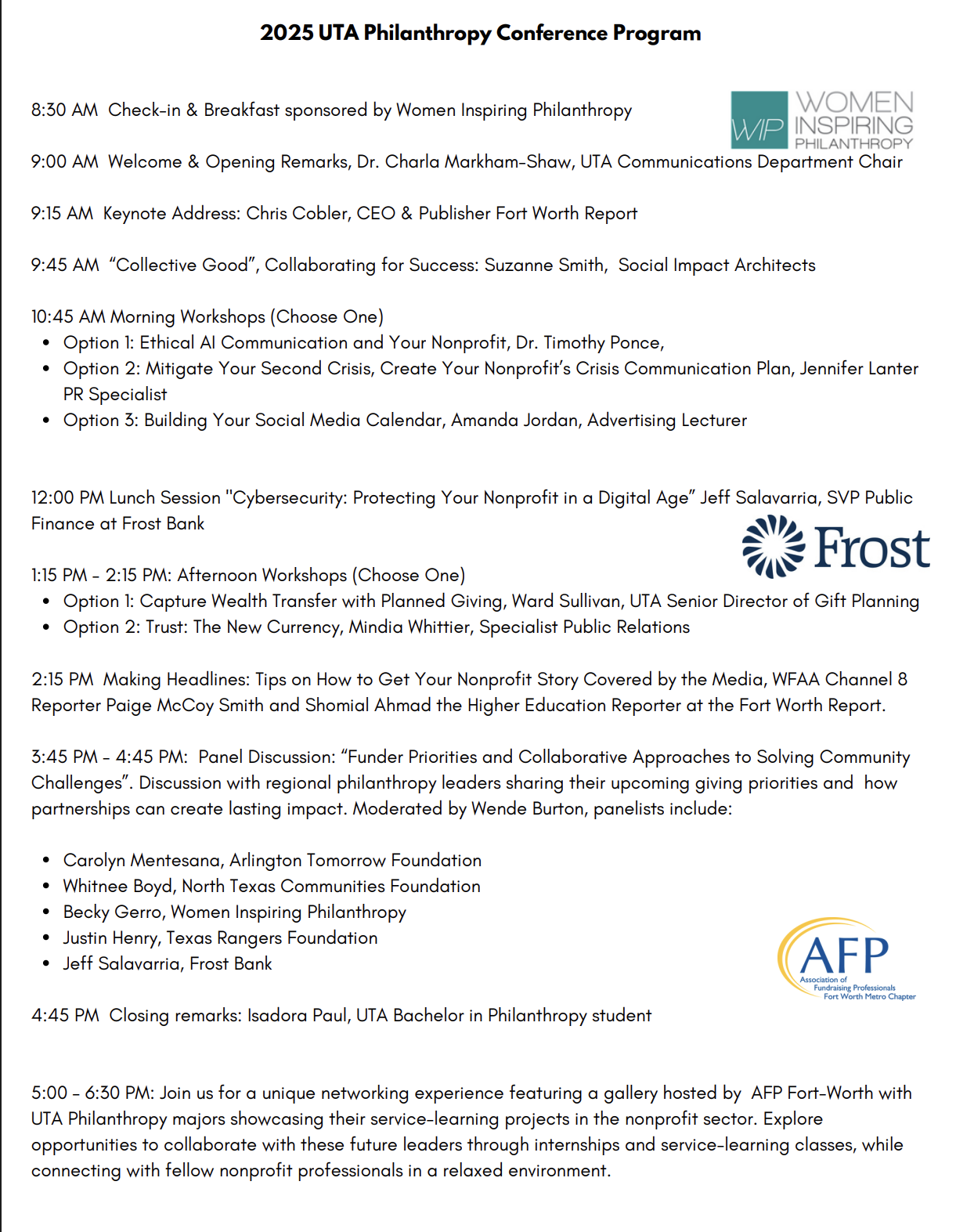
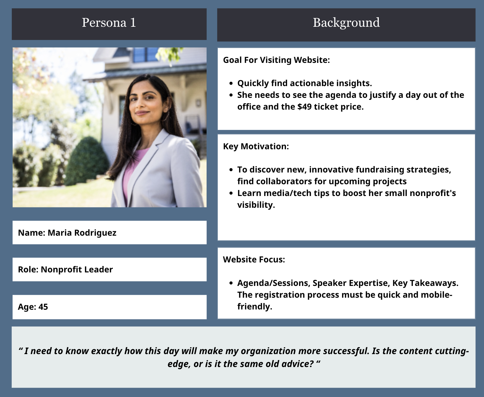
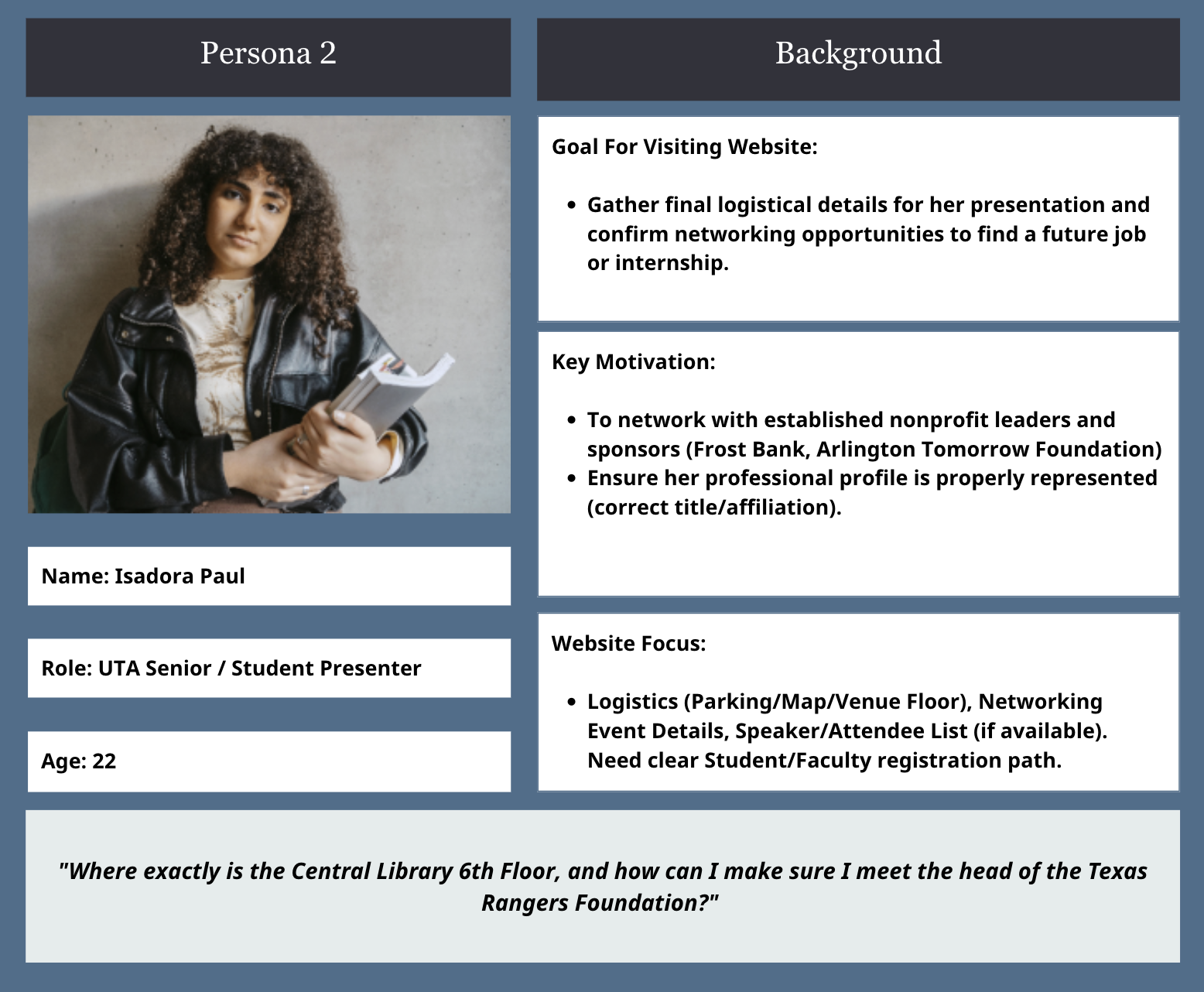
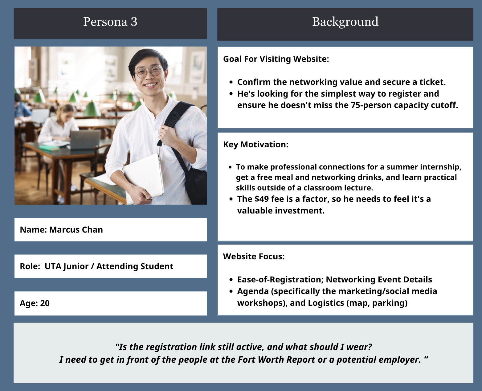
The target audience includes individuals interested in networking and growth in philanthropy, particularly focusing on digital communication, media promotion, public relations, cybersecurity, and building new partnerships and resources.
Communication Strategy
Promotion will focus on effective digital outreach via social media and email (two reminders per week leading up to the event), using flyers and QR codes for easy access, and ensuring all users receive prompt email confirmation for registration and payment.
Competitive Positioning (Similar events happening in the area) To counter competing philanthropy events (like the FCEF Gala and Inspiring Hope Luncheon), the strategy is to encourage attendance by actively highlighting the conference's unique keynote speakers, activities, and gifts.
DYNAMIC FEATURES
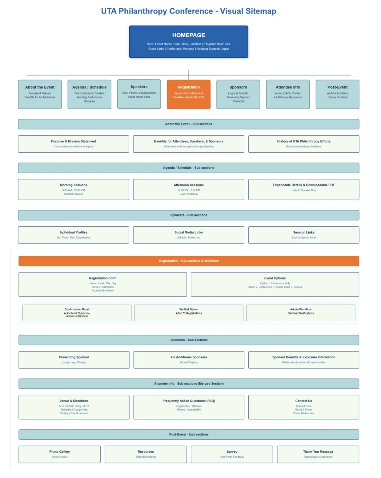
Attendee Registration
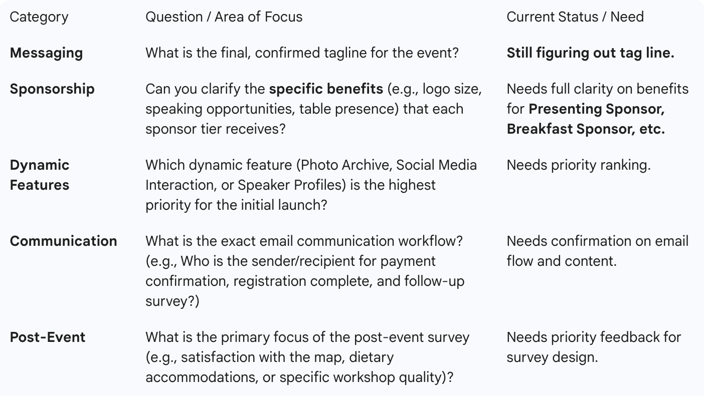
The user will provide First and Last name, email, title, organization they represent, dietary needs, and accessibility needs.
One of the main ideas of the survey was wanting to have ease of registration, increase attendance, and have struggles in the past with people signing up.
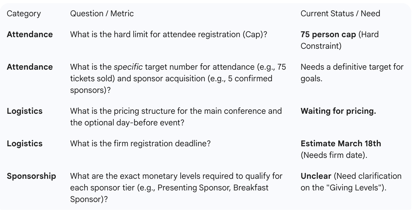
Expect to use a database to store the data of the attendees, like name and email, as well as an html form to retrieve the data from the user and then after 75 registers it will cut off.
Speaker Profiles
The speakers will have to provide a short bio about themselves and the topic they may be discussing during the event, a professional headshot, as well as the social media links they would like to display.
As discussed in the interview with the client, they thought having a speaker profile would be nice as well as giving a way they could give back by promoting their social media.
Expect to gather all the information about the speakers and store it in a profile displayed on the website.
Photo Archive
The client will have to provide pictures of the event from the last year they held it, and if she wants to continue to use the website in the future, then will have to provide pictures of any other events they held.
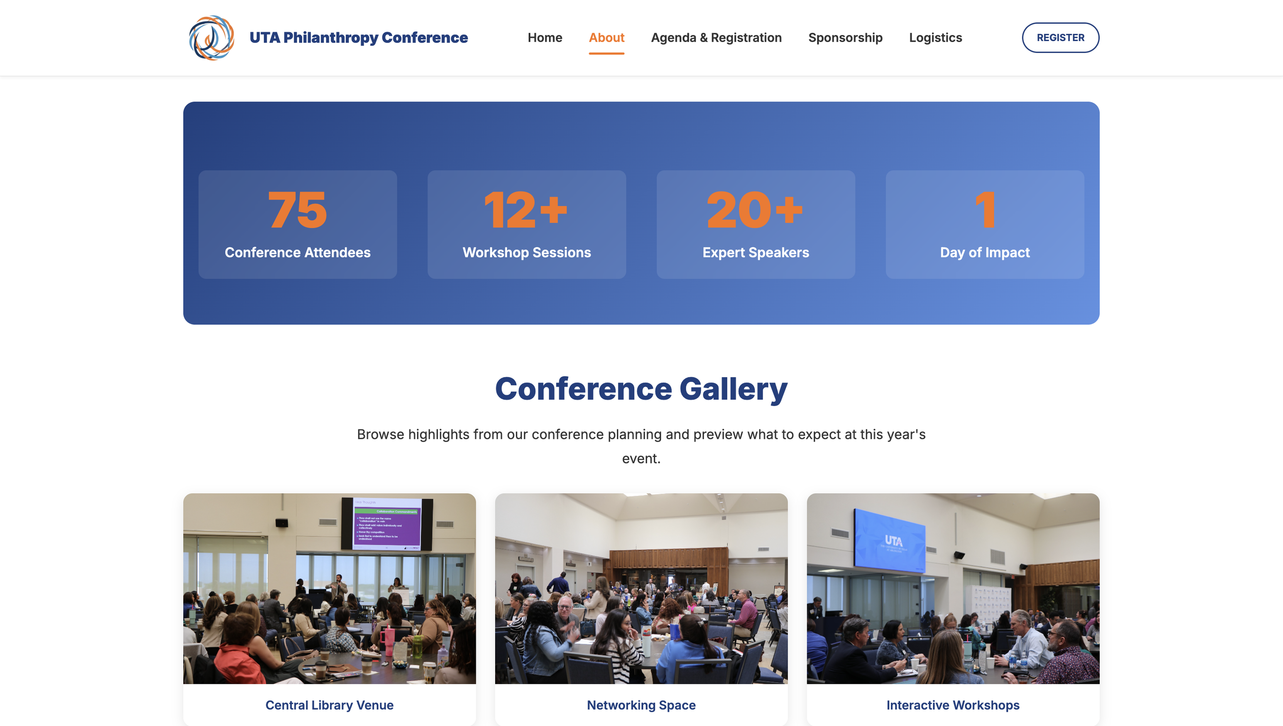
One of the many concerns about going to a conference like this is that you may not know what the event could look like so being able to see it helps gain newcomers to the conference.
Expect to build a carousel of photos that will either rotate on its own or rotate on a user input.
Qualitative Information (Priority, Preference, & Detail)
INTERVIEW QUESTIONS
Quantitative Metrics (Measurable Goals & Hard Constraints)
User Personas
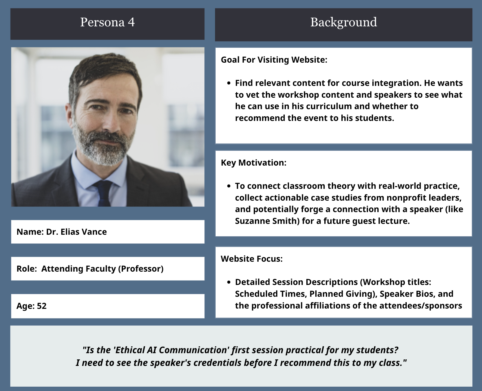
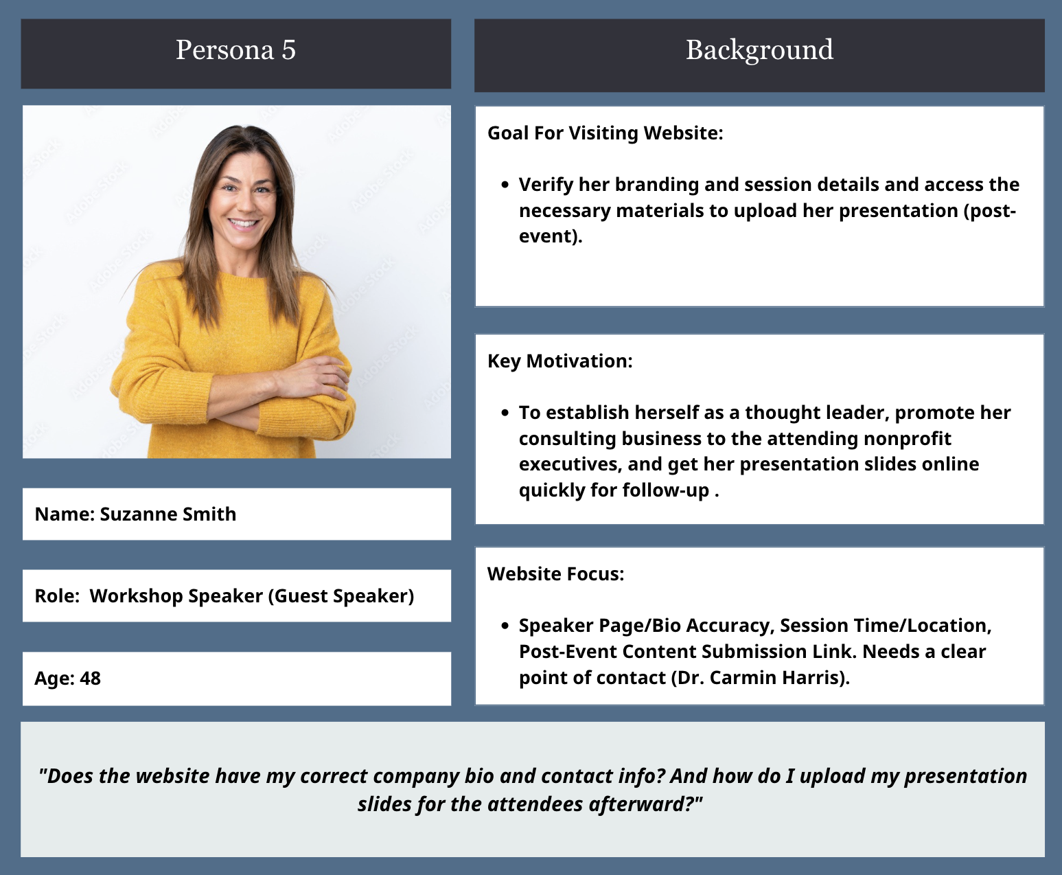
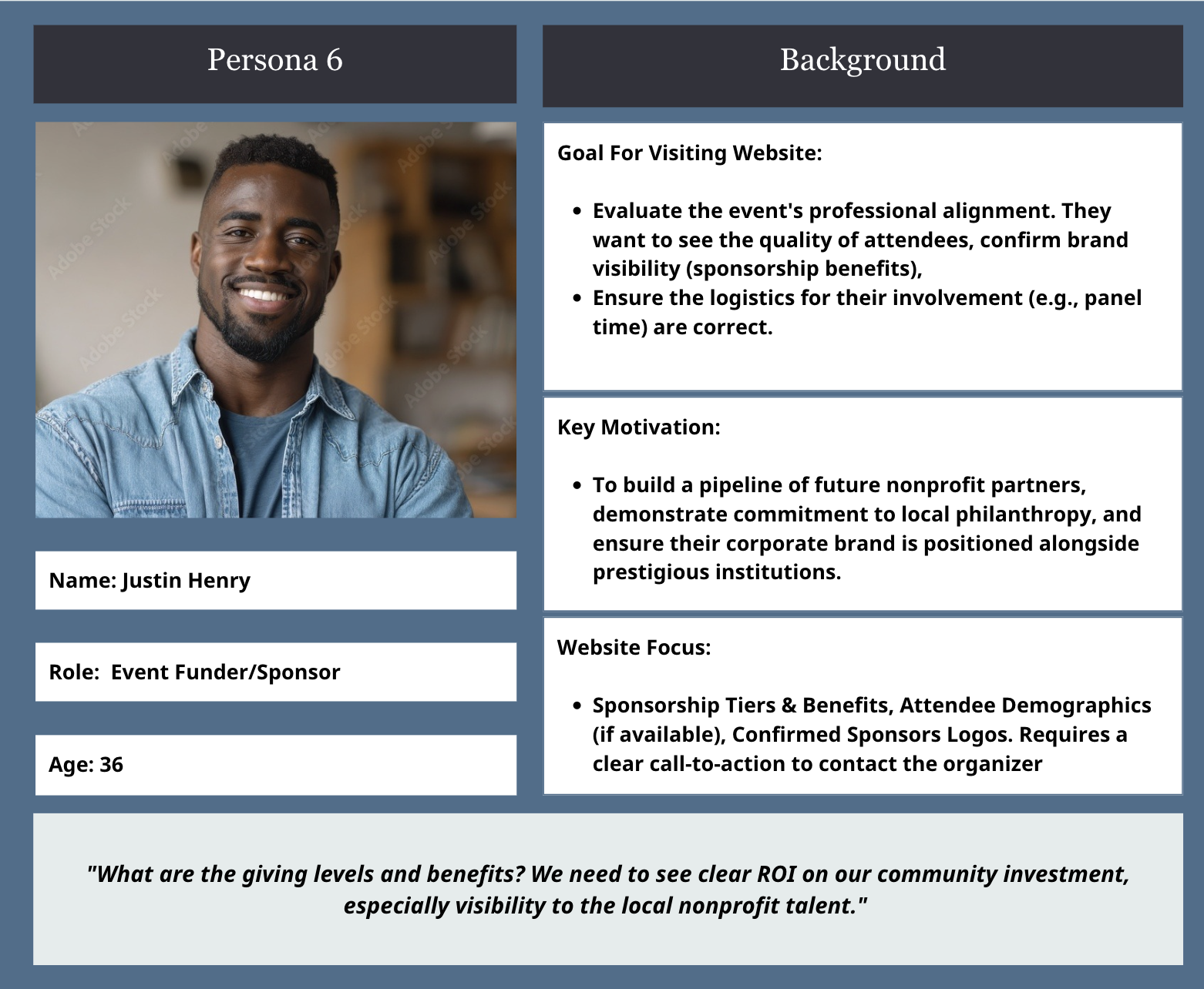
User Flows
WIREFRAMES
Logo Design
The logo integrates UTA’s signature orange and blue color palette to maintain our brand identity and institutional recognition. The swirling, interwoven shapes symbolize collaboration, and forward motion. These are core values of philanthropy and partnership. The circular motion communicates inclusivity and continuous impact, aligning with the theme “Uniting for Good.” The modern sans-serif typeface in the wordmark reflects professionalism and approachability, suitable for both academic and nonprofit audiences.
Responsive Design Considerations
On desktop, layouts display content side-by-side for better scanning and visual balance.
On mobile, stacking is prioritized for readability and touch navigation, ensuring essential details like session times and CTAs remain visible without zooming.
Interactive buttons and stacked layouts are emphasized on mobile to support one-handed navigation and readability for on-the-go users during the event.
DESIGN RATIONALE
Home Page and Content
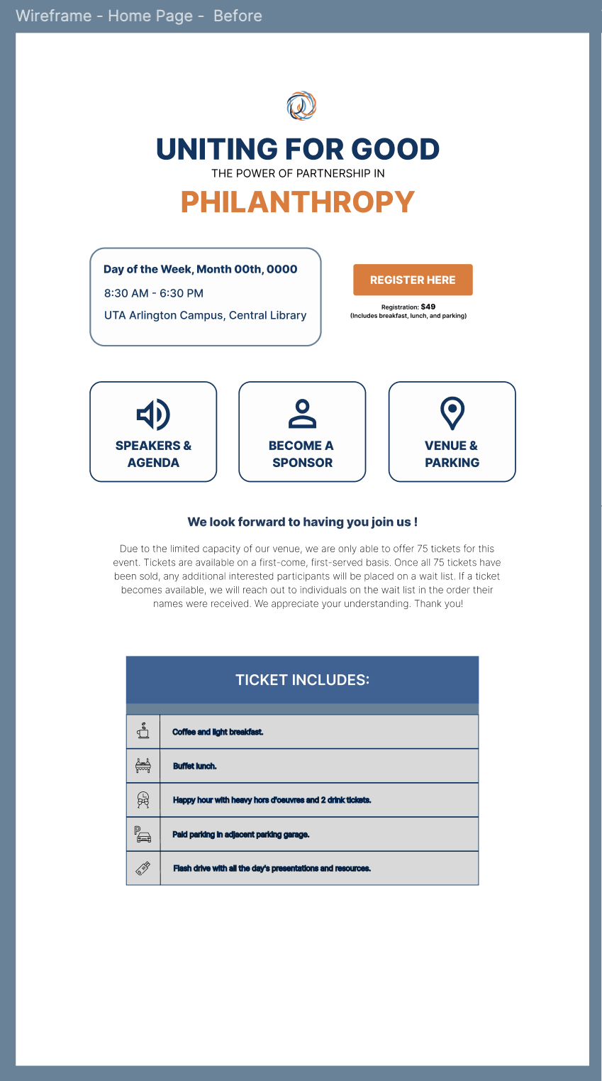
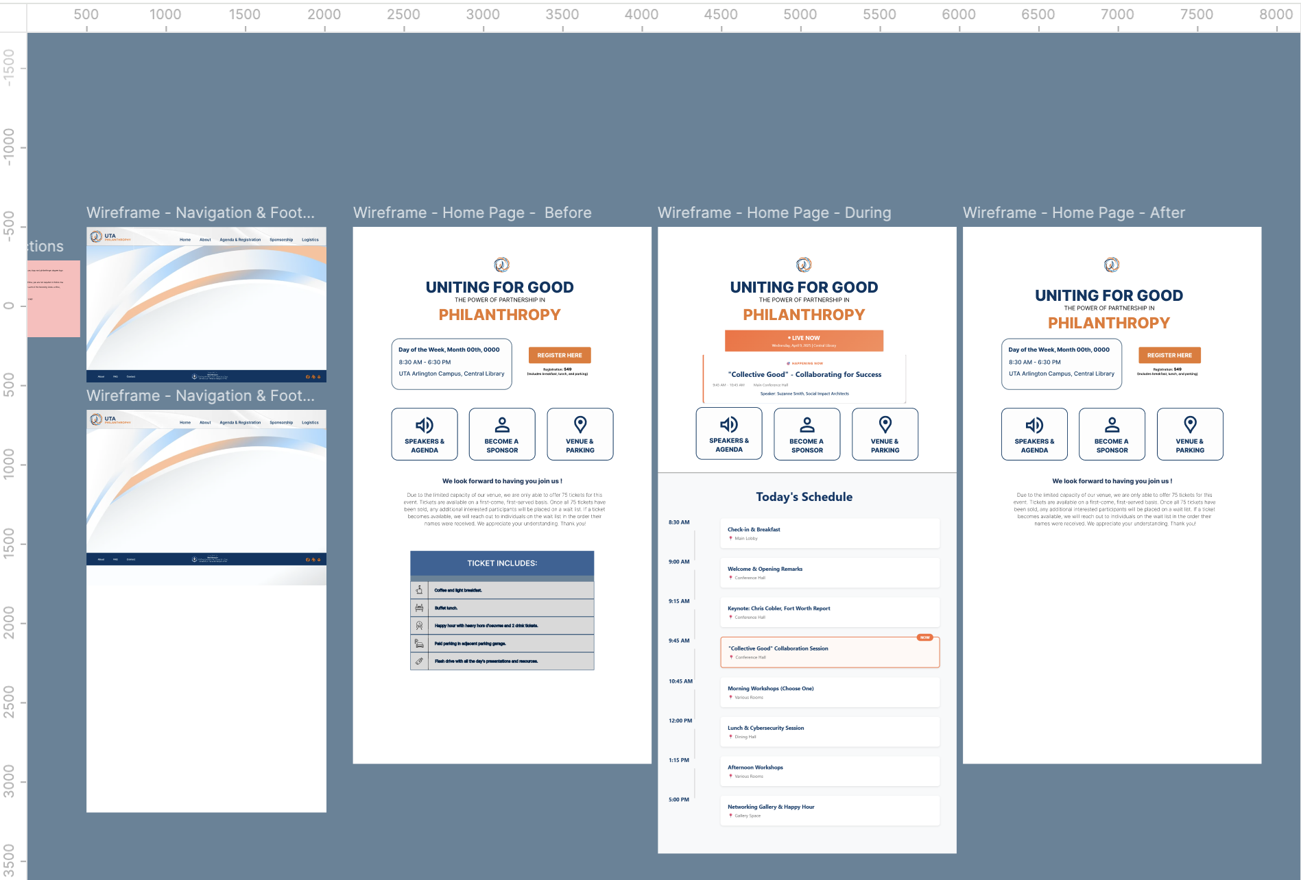
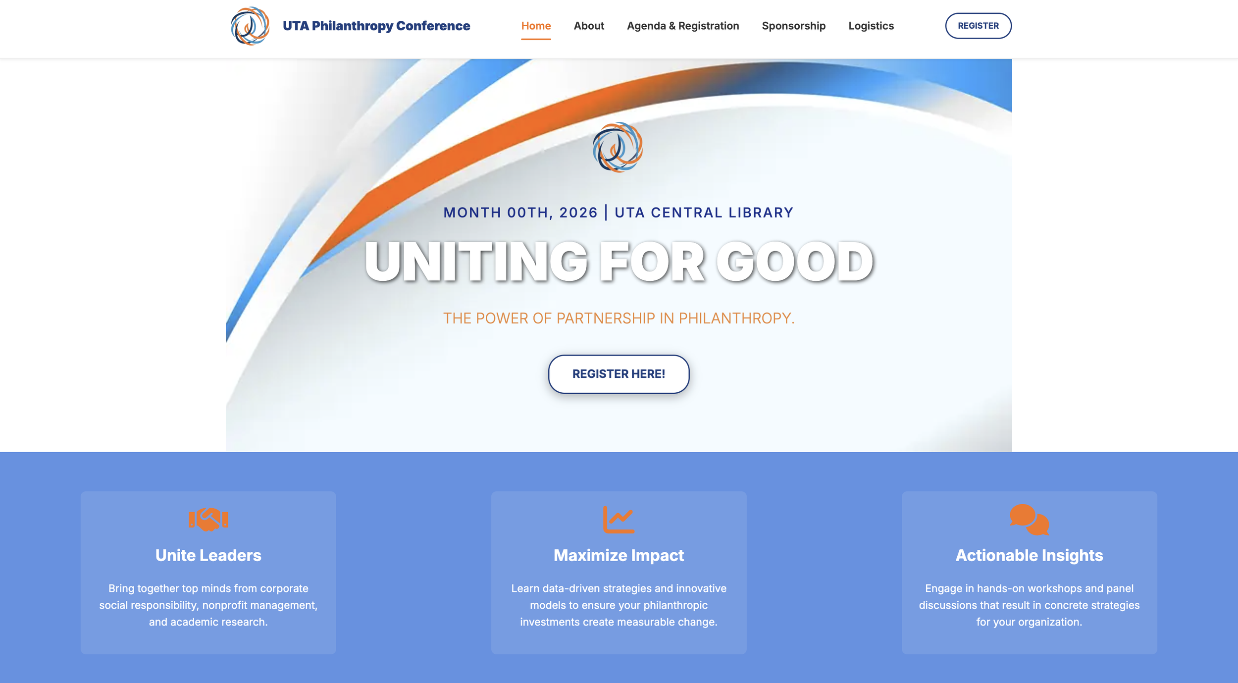
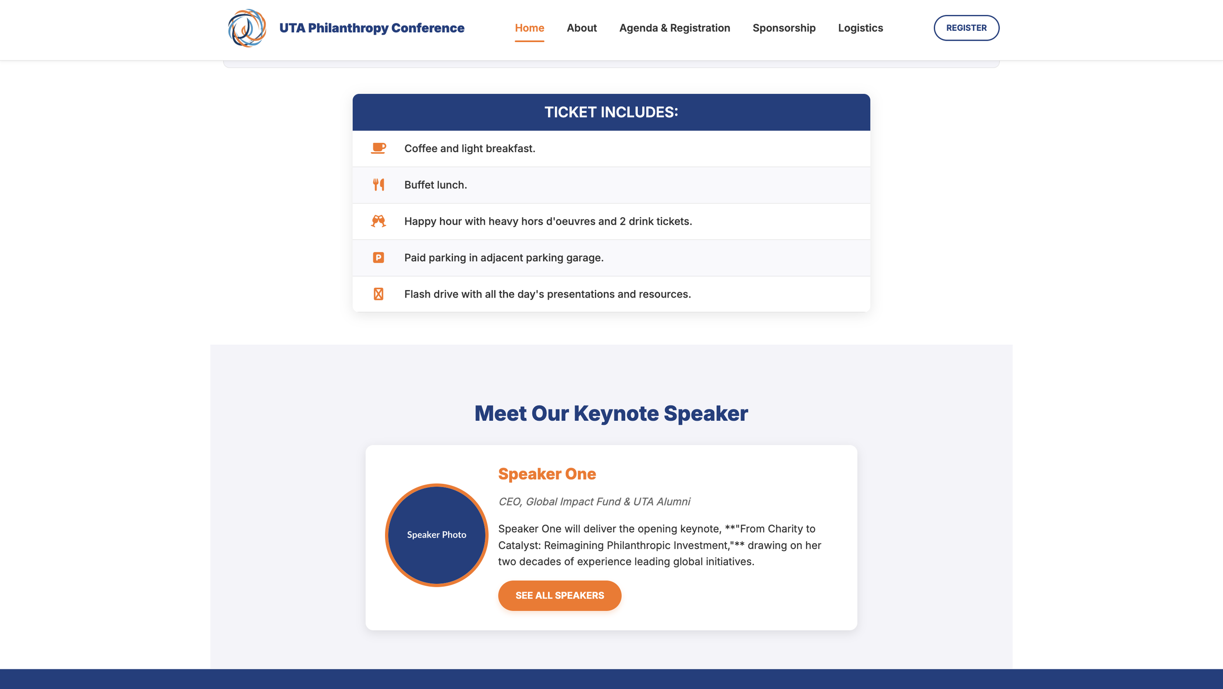
Before the Conference - The layout prioritizes registration, agenda highlights, and event purpose. Key calls-to-action such as the “Register Here” button and supporting sections like ticket inclusions and keynote speaker preview address the goals of informing and converting interested visitors into attendees. This version targets potential participants, like students, nonprofit leaders, and sponsors.
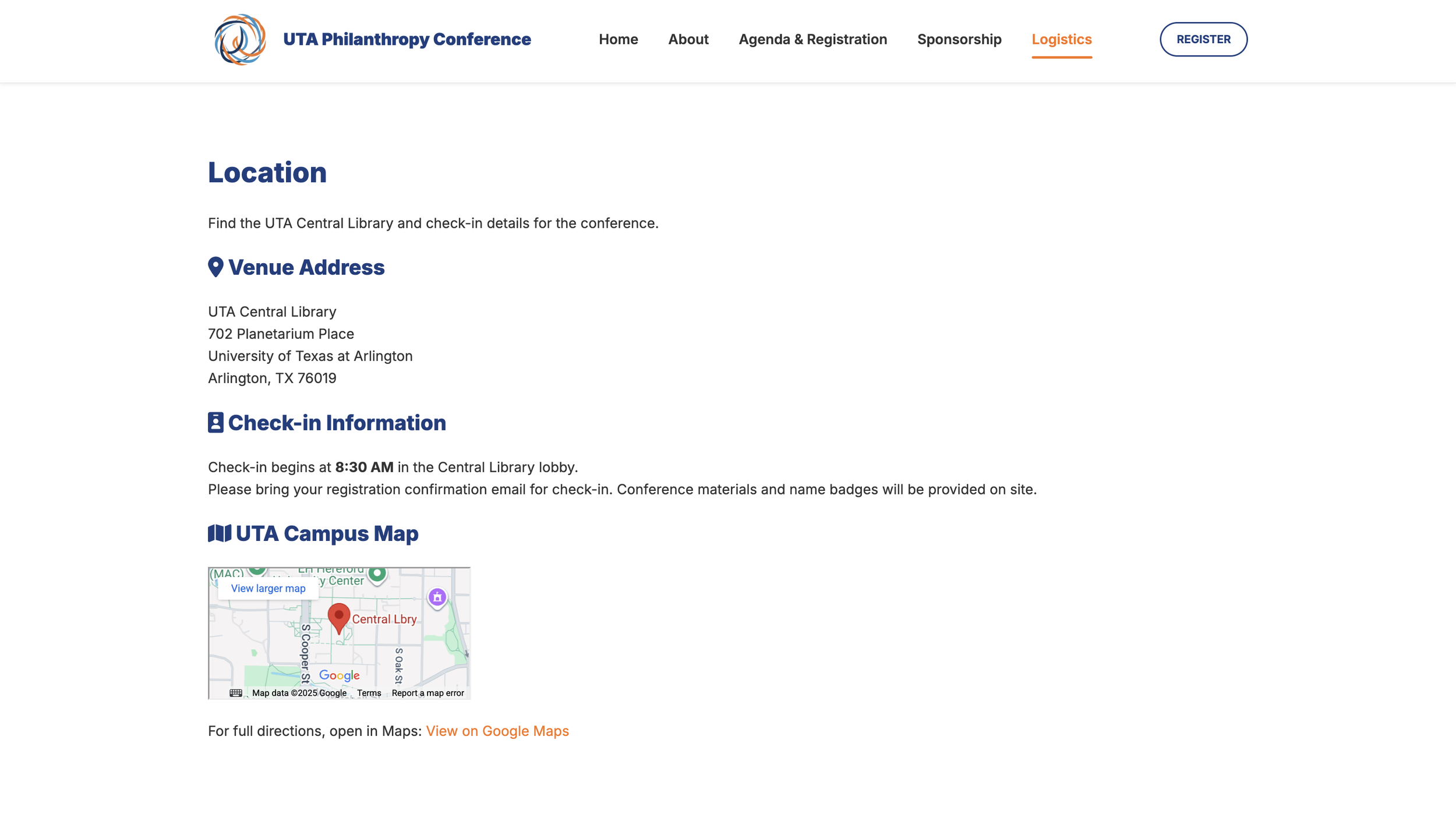
During the Conference - This version supports active event-day participants. Real-time updates such as “Current Live Event” banners and a prominent “View Parking” button meet logistical needs for attendees on-site. The simplified layout ensures fast access and clarity, emphasizing functionality and real-time relevance over promotional content.
After the Conference -The post-event version focuses on maintaining engagement and anticipation for the next year. The primary CTA “Subscribe for Updates” invites continued involvement while reinforcing community through gratitude messaging “See You Next Year!”. This maintains relationships with attendees and encourages long-term participation.
About Page and Content
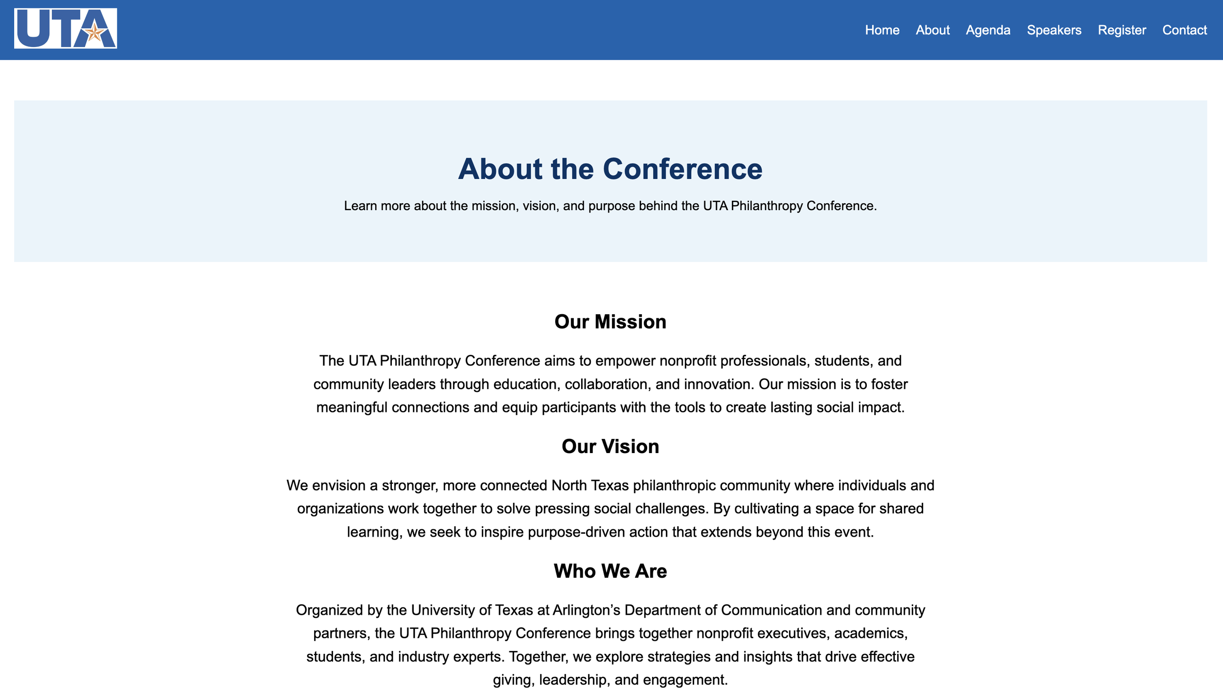
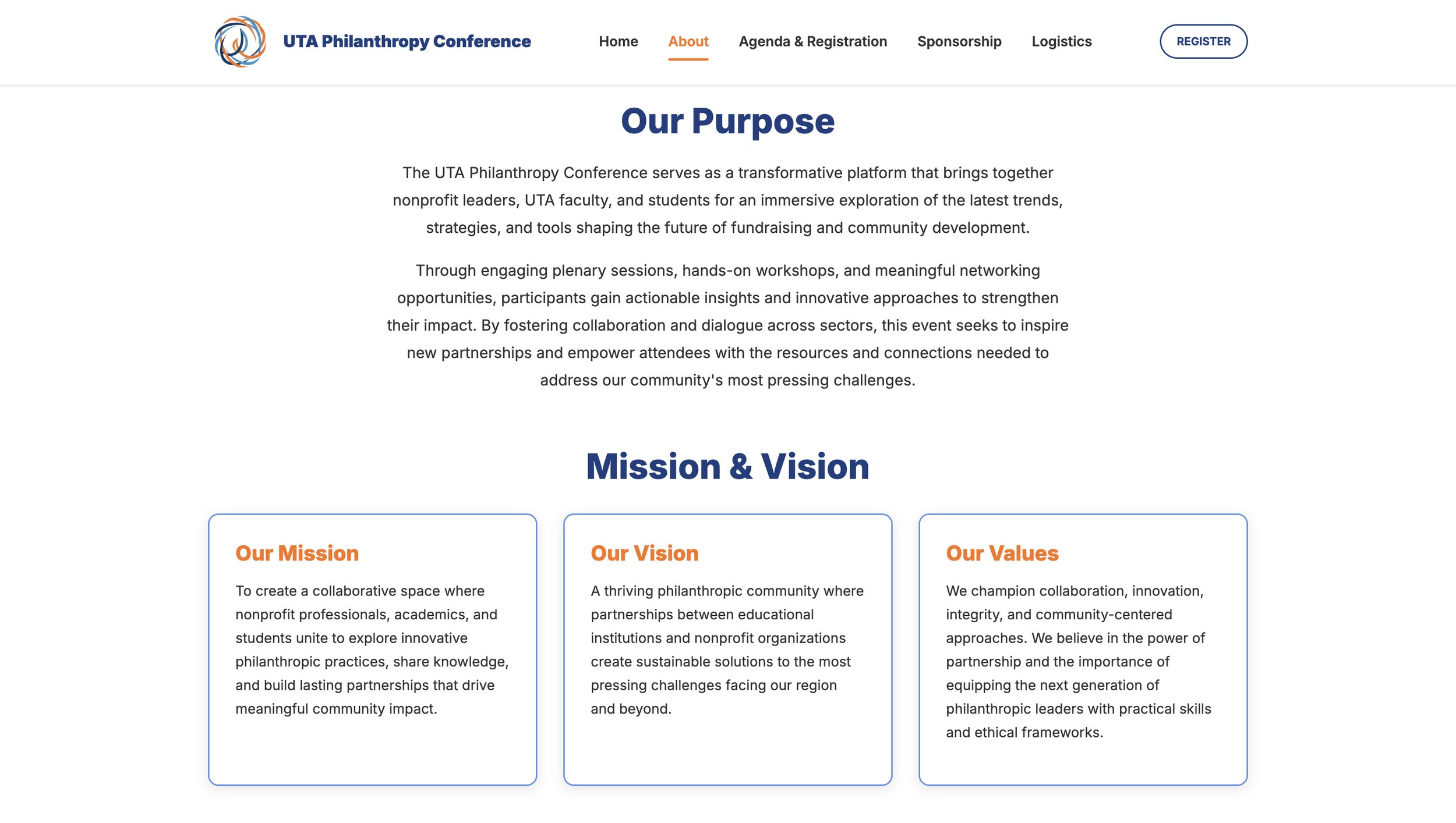
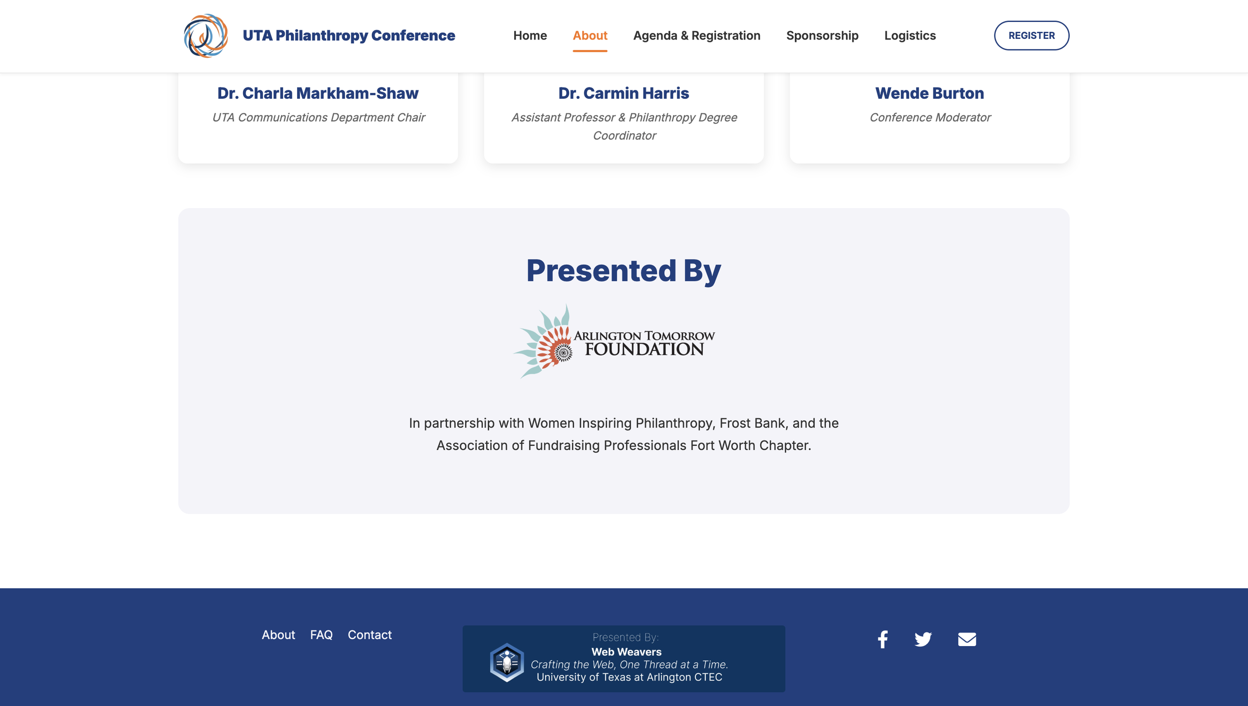
The About Page explains the conference’s mission, vision, and values to establish purpose.
Before the Conference: Full informational depth (mission, vision, gallery, and organizing team) supports credibility for new visitors.
During the Conference: Updated visuals and simplified text help attendees quickly reference session context and speaker info without excessive scrolling.
After the Conference: The “Presented By” and sponsor sections shift focus toward gratitude, transparency, and continued partnership.
Other Design Decisions
Typography - Clean sans-serif fonts, like Open Sans and Poppins, were selected for readability, accessibility, and a modern academic feel.
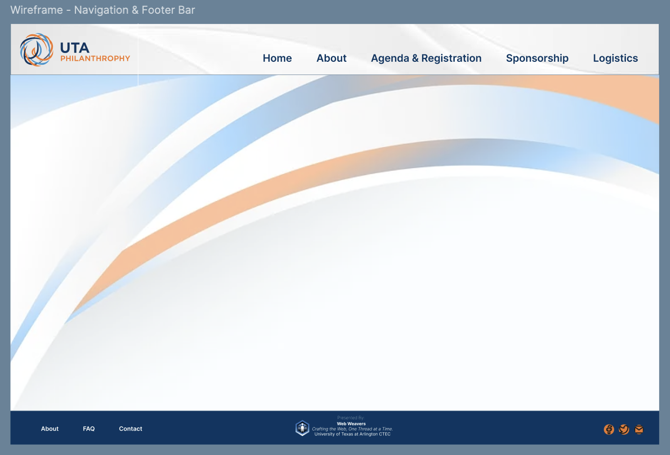
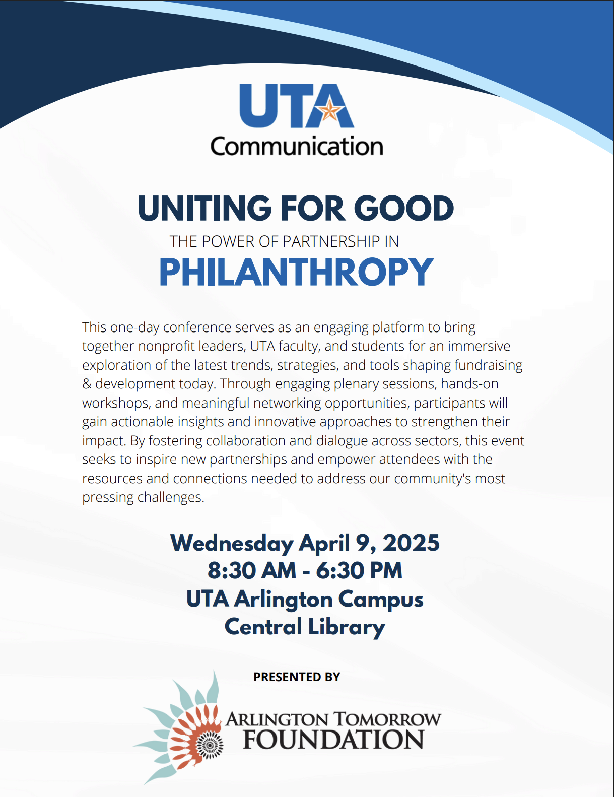
Background Imagery - The curved abstract wave reflects UTA’s branding elements while representing unity and innovation. It ties visually to the circular logo and reinforce a sense of collective movement toward positive impact.
Layout & Accessibility - Generous white space, clear visual hierarchy, and color contrast with dark text on light backgrounds ensure ADA compliance and visual clarity for all users. The consistent use of iconography improves navigation and content recall across devices.
PROTOTYPES
Reusable Variable (Color Palette) - Figma
SOFTWARES USED
